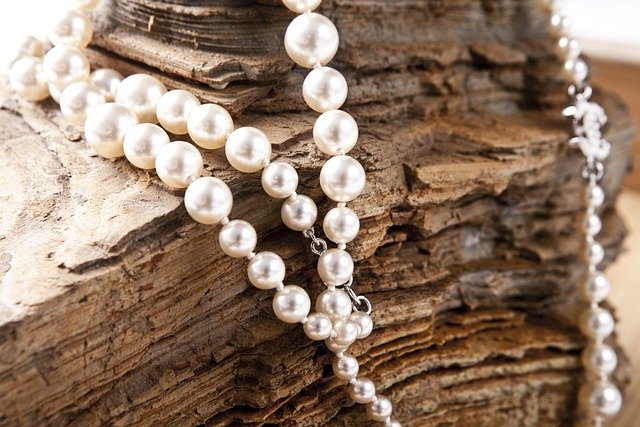
Why Pearls Are Having a Modern Moment
Pearls have found their way into unexpected corners of modern branding, transforming how companies connect with consumers who crave both elegance and authenticity.
The shift happened gradually, then all at once. Major brands started noticing that pearl symbolism resonated with audiences seeking premium experiences and timeless quality. What began as subtle design choices has evolved into full-scale marketing strategies that celebrate pearls in ways you’d never expect.
From tech giants to coffee chains, companies are tapping into pearl’s unique ability to communicate luxury without pretension. The result? Some truly surprising brand partnerships with this ancient symbol of perfection.
The Timeless Appeal of Pearls in Contemporary Branding
Why Brands Are Choosing Pearl Symbolism
Pearl symbolism carries weight that modern consumers immediately recognize. Unlike flashy diamonds or bold gold, pearls whisper rather than shout. They suggest refinement, patience, and natural beauty – qualities that align perfectly with today’s preference for authentic brand experiences.
Smart marketers have noticed this shift. They’re moving away from aggressive luxury messaging toward something more subtle and sophisticated. Pearls provide the perfect metaphor for this approach.
The natural formation process of pearls also speaks to modern values. Consumers appreciate the story of transformation – how irritation becomes beauty through time and patience. This narrative works beautifully for brands wanting to communicate growth, resilience, and positive change.
The Psychology Behind Pearl Marketing
Psychologically, pearls trigger specific emotional responses that brands find irresistible. Research shows that pearl imagery creates feelings of calm, trust, and aspiration without triggering anxiety about affordability or accessibility.
This emotional sweet spot is marketing gold. Consumers feel elevated but not excluded. They experience luxury without intimidation.
The color psychology of pearl tones – those soft whites, creams, and iridescent sheens – also works in brands’ favor. These colors suggest cleanliness, purity, and premium quality across virtually every industry.
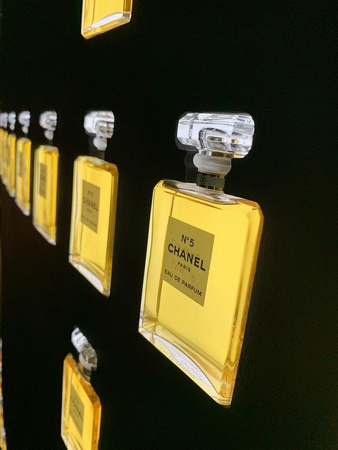
Brand Spotlight One: Chanel’s Revolutionary Pearl Integration
From Coco’s Vision to Modern Campaigns
Coco Chanel‘s love affair with pearls began in the 1920s, but today’s Chanel takes pearl integration to entirely new levels. The brand doesn’t just use pearls in jewelry – they’ve woven pearl aesthetics into everything from packaging design to digital experiences.
Their recent campaigns feature pearl-inspired typography, where letters shimmer with nacreous effects. Even their social media filters incorporate subtle pearl finishes that make users feel instantly more glamorous.
The genius lies in consistency. Every touchpoint reflects pearl qualities: smoothness, luster, and organic perfection.

Coco Chanel: An Essence of Mystery
- Author: Isabelle Fiemeyer
- Edition: Authorized update
- Includes: Labrunie excerpts
- Topics: wartime controversy
Unexpected Pearl Applications in Fashion
Chanel’s pearl philosophy extends far beyond accessories. Their ready-to-wear collections feature pearl-inspired buttons, pearl-toned fabrics, and even pearl-shaped architectural details in their boutiques.
The brand’s makeup line includes “pearl glow” formulations that mimic the way light plays across pearl surfaces. These products don’t contain actual pearl powder – they capture the optical effects that make pearls so captivating.
Even their fragrance bottles echo pearl shapes and finishes. The connection feels natural, never forced.
How Chanel Redefined Pearl Luxury
What Chanel did brilliantly was democratize pearl luxury. They took something historically associated with formal occasions and made it everyday chic. Pearl details appear on casual pieces, workout wear, and street-style accessories.
This strategy expanded their market while maintaining exclusivity. Customers who couldn’t afford pearl necklaces could still participate in pearl culture through other products.
The brand proved that pearl symbolism could be contemporary and accessible without losing its premium associations.
Brand Spotlight Two: Starbucks and the Pearl of Coffee Culture
The Hidden Pearl Story in Starbucks Branding
Most people miss Starbucks’ subtle pearl references, but they’re everywhere once you know what to look for. The company’s approach to pearl symbolism focuses on the idea that great coffee, like great pearls, requires time, patience, and perfect conditions.
Their premium Reserve locations feature pearl-toned design elements: iridescent tiles, mother-of-pearl accents, and lighting that mimics the way pearls catch light. The effect is sophisticated without being pretentious.
Even their logo evolution incorporates pearl thinking – that smooth, refined aesthetic that suggests quality and craftsmanship.
Limited Edition Pearl-Inspired Collections
Starbucks’ seasonal collections often feature pearl colorways and finishes. Their holiday tumblers frequently showcase pearl-white designs with subtle shimmer effects. These aren’t explicitly marketed as “pearl” products, but the visual language is unmistakable.
The brand’s collaboration with artists often results in pearl-themed artwork for stores and merchandise. These pieces celebrate the organic, natural beauty that pearls represent.
Their mobile app even uses pearl-inspired gradients and color transitions that create a premium digital experience.
Creating Premium Experience Through Pearl Aesthetics
Starbucks understands that pearl aesthetics communicate premium positioning without alienating everyday customers. Their Pearl locations (yes, some are actually named Pearl) feature elevated design and exclusive menu items.
The coffee preparation rituals at these locations mirror pearl formation – slow, deliberate, and focused on perfection. Baristas receive special training to emphasize the craft and patience required for exceptional coffee.
This positioning allows Starbucks to charge premium prices while maintaining their accessible brand image.
Brand Spotlight Three: Apple’s Minimalist Pearl Philosophy
Pearl White Product Design Evolution
Apple’s relationship with pearl aesthetics runs deeper than their famous “Pearl” color options. The company’s entire design philosophy reflects pearl principles: organic shapes, flawless surfaces, and subtle sophistication.
Their product photography often emphasizes the pearl-like qualities of their devices. That smooth, lustrous finish that seems to glow from within. The way light moves across their surfaces mirrors how it plays across pearls.
Even their packaging adopts pearl thinking – clean, minimal, and focused on revealing rather than concealing the beauty within.

V-MORO White Pearl Beaded Apple Watch Band
- Band: Pearls, crystals, beads
- Fit: Apple Watch 42–46mm
- Wrist: 5.5–6.5 in (women)
- Closure: Elastic, no buckle
The Pearl Finish Technology Innovation
Apple’s material science team has developed finishes that genuinely mirror pearl optical properties. Their “Pearl” colored devices don’t just look white – they shift and change depending on lighting conditions, just like real pearls.
This technology required years of development and represents a significant investment in aesthetic innovation. The company clearly believes pearl-inspired finishes provide competitive advantage.
Their marketing materials emphasize these optical effects, positioning them as premium features that justify higher prices.
Connecting Simplicity with Elegance
Apple’s pearl philosophy extends to user experience design. Their interfaces prioritize the same qualities that make pearls appealing: smoothness, clarity, and effortless beauty.
The company’s retail spaces also reflect pearl thinking. Clean lines, natural materials, and lighting designed to make products glow like pearls in oysters.
This consistent approach creates a cohesive brand experience that feels both luxurious and approachable.
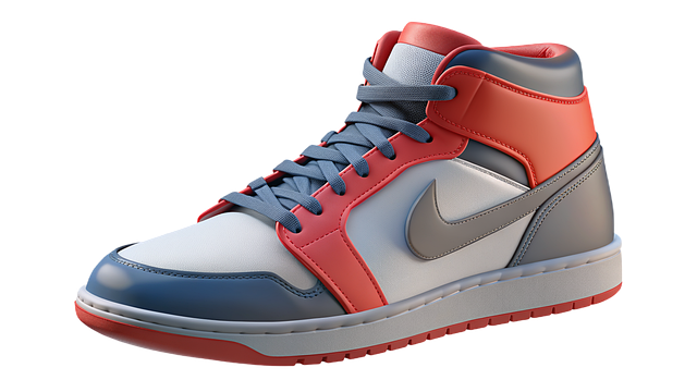
Brand Spotlight Four: Nike’s Athletic Pearl Revolution
Performance Meets Pearl Aesthetics
Nike’s approach to pearl symbolism breaks traditional boundaries. They’ve taken something historically associated with femininity and formal occasions and made it athletic and edgy.
Their pearl-inspired colorways appear across both men’s and women’s products. The “Pearl Pink” and “Cream Pearl” options in their athletic footwear challenge conventional color expectations for sports equipment.
The brand positions these choices as confident and sophisticated rather than soft or traditional.

- Model: DH3158-009
- Upper: ≥20% recycled
- Style: '80s basketball echo
- Construction: Vulcanized sole
Limited Edition Pearl Colorways
Nike’s limited edition releases often feature pearl-inspired color stories. Their collaboration with high-fashion designers frequently results in pearl-toned athletic wear that bridges sports and luxury markets.
These releases generate significant buzz among collectors and fashion enthusiasts who appreciate the unexpected combination of athletic performance and pearl elegance.
The scarcity model works particularly well with pearl-themed products, as pearls themselves are naturally rare and precious.
Breaking Traditional Gender Boundaries
Nike’s pearl strategy deliberately challenges gender stereotypes in athletic wear. Their marketing campaigns show male athletes confidently wearing pearl-toned products, repositioning these colors as powerful rather than delicate.
This approach expanded their market while making a cultural statement about modern masculinity and self-expression.
The success of these campaigns influenced other athletic brands to experiment with traditionally “feminine” color palettes.
Brand Spotlight Five: Lexus and Automotive Pearl Excellence
Pearl Paint Technology Leadership
Lexus pioneered automotive pearl paint technology, developing finishes that genuinely capture the optical complexity of natural pearls. Their “Pearl White” isn’t just white paint – it’s a multi-layered system that creates depth and luminosity.
The development process took years and required collaboration with cosmetic companies to understand how to recreate pearl effects at automotive scale.
This innovation became a signature feature that competitors struggled to match.

White Pearl Touch-Up Paint Pen for Lexus
- Color: Eminent White Pearl 085
- Finish: Gloss, Chip-Resist
- 2-in-1: Pen & Brush
- Dries: ~10 min; 0.4 fl oz
The Luxury Connection Strategy
Lexus explicitly connects their pearl finishes to luxury and sophistication in their marketing. Their campaigns often feature actual pearls alongside their vehicles, drawing direct comparisons between natural and automotive beauty.
The brand positions pearl paint options as premium upgrades that reflect owners’ refined taste and appreciation for craftsmanship.
This strategy successfully differentiates Lexus from competitors while justifying higher prices.
Environmental Responsibility in Pearl Finishes
Lexus has developed environmentally responsible pearl paint systems that maintain visual impact while reducing environmental harm. This approach aligns with modern consumers’ environmental consciousness.
The brand communicates this innovation as another form of perfection – achieving beauty without compromise.
Their sustainable pearl technology has become a selling point for environmentally conscious luxury consumers.
The Business Impact of Pearl Branding
Market Response and Consumer Psychology
Market research consistently shows positive consumer response to pearl-inspired branding and design. Consumers associate pearl aesthetics with quality, sophistication, and value – even when actual pearls aren’t involved.
This psychological association allows brands to command premium pricing for pearl-themed products and experiences. The effect works across demographics and product categories.
Brand loyalty also increases when companies successfully integrate pearl symbolism into their identity. Consumers form emotional connections with brands that share their aesthetic values.
Sales Performance Analysis
Products featuring pearl-inspired design elements consistently outperform standard alternatives in sales metrics. The premium positioning allows for higher margins while maintaining strong demand.
Limited edition pearl collections typically sell out faster than regular releases, indicating strong consumer appetite for these aesthetic choices.
The data suggests that pearl symbolism provides genuine competitive advantage in crowded marketplaces.
Brand Differentiation Strategies
Pearl symbolism offers effective differentiation in markets where functional differences between competitors are minimal. The aesthetic and emotional associations help brands stand out.
Companies using pearl-inspired branding report improved brand recognition and recall in consumer surveys. The visual distinctiveness creates memorable brand experiences.
This differentiation proves particularly valuable in luxury and premium market segments where emotional connection drives purchasing decisions.
Conclusion: The Lasting Power of Pearl Symbolism
The success of pearl-inspired branding across diverse industries proves that certain symbols transcend cultural and categorical boundaries. Pearls represent universal values that modern consumers crave: authenticity, patience, natural beauty, and quiet confidence.
These five brands demonstrate different approaches to pearl symbolism, from Chanel’s heritage luxury to Nike’s gender-boundary breaking. Each found ways to make pearl aesthetics relevant to their unique market position.
The trend shows no signs of slowing. As consumers increasingly value experiences over possessions and authenticity over flash, pearl symbolism becomes even more relevant. Smart brands will continue finding unexpected ways to integrate these timeless qualities into modern experiences.
The pearl revolution in branding isn’t just about following trends. It’s about understanding what consumers really want: products and experiences that make them feel sophisticated, confident, and connected to something beautiful and enduring.
That’s the lasting power of pearl symbolism. And these brands prove it works.


Explore pearl symbolism across history - from lunar connections and wealth to purity and spiritual journeys. Discover what pearls represent in different cultures as luminous June birthstone.
Coco Chanel: From Poverty to Fashion Icon Coco Chanel's journey from an impoverished childhood to a legendary fashion designer revolutionised women's fashion. Her comfortable, timeless designs and iconic products left an indelible mark on 20th century fashion.